Meta Branding
Years 2020—2022
︎Brand Identity
︎Design
MY ROLE:
Creative Lead, Art Director and Designer
Between 2020 and 2022 I had the opportunity to work as an Art Director and Creative Lead at BUCK on several projects for Meta. From a design perspective, it was a particularly interesting time to work with the brand, as this period comprises the transition from Facebook to Meta. More than a rebrand, this movement meant a complete pivot for the company, as it marks the beginning of a crusade to the metaverse and everything that derives from that.
Pivoting towards the metaverse entailed building a new world-class branding system that serves as a shared dimensional canvas for everyone to create with. If in the past brand expression was restricted to two dimensions, in this new era the brand needed to be able to exist in three dimensions and virtual worlds.
BUCK has partnered with Meta on several projects, helping to define and refine the building blocks that make up this new branding system.

YEAR 2020 - FACEBOOK COMPANY ICONS SYSTEM
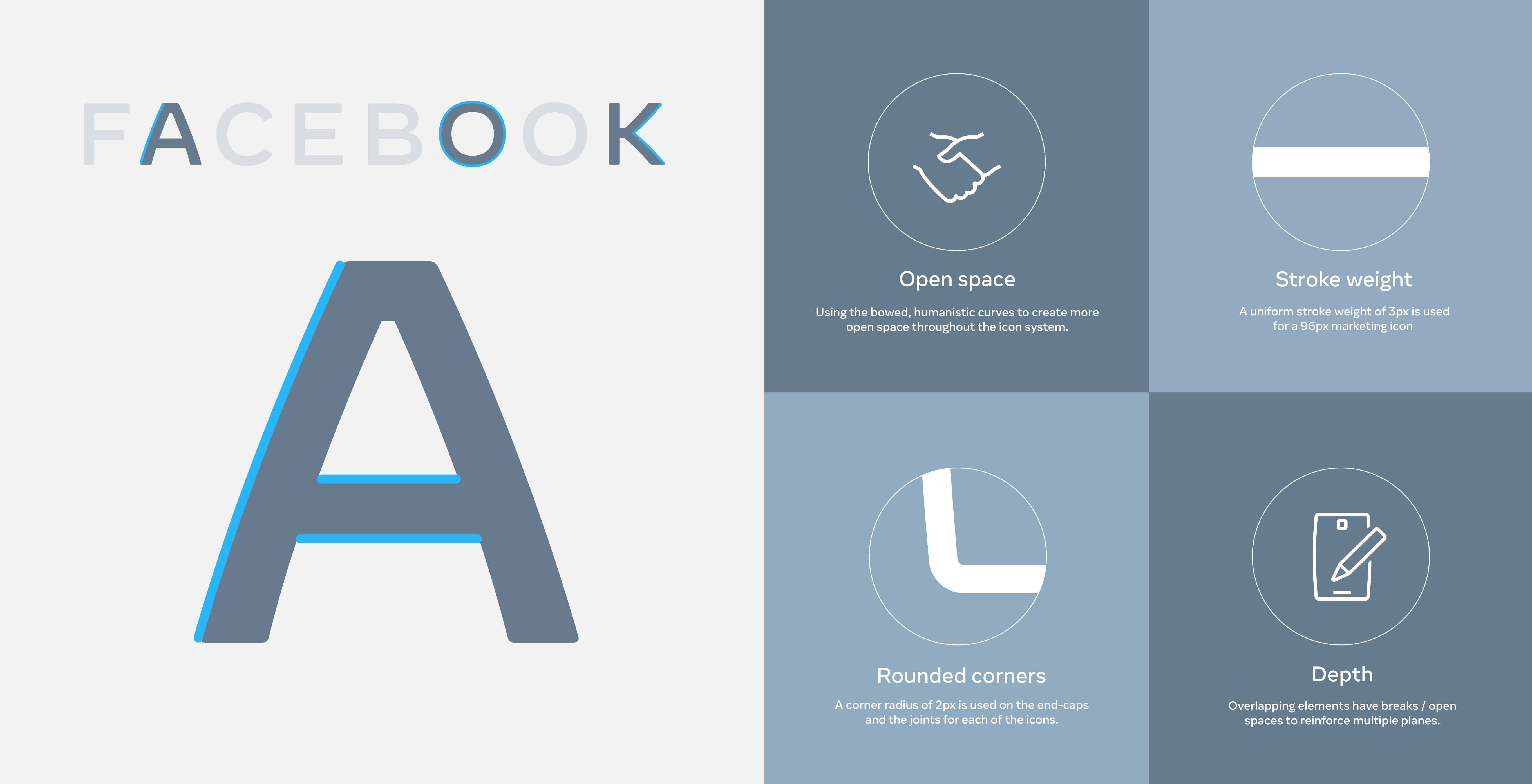
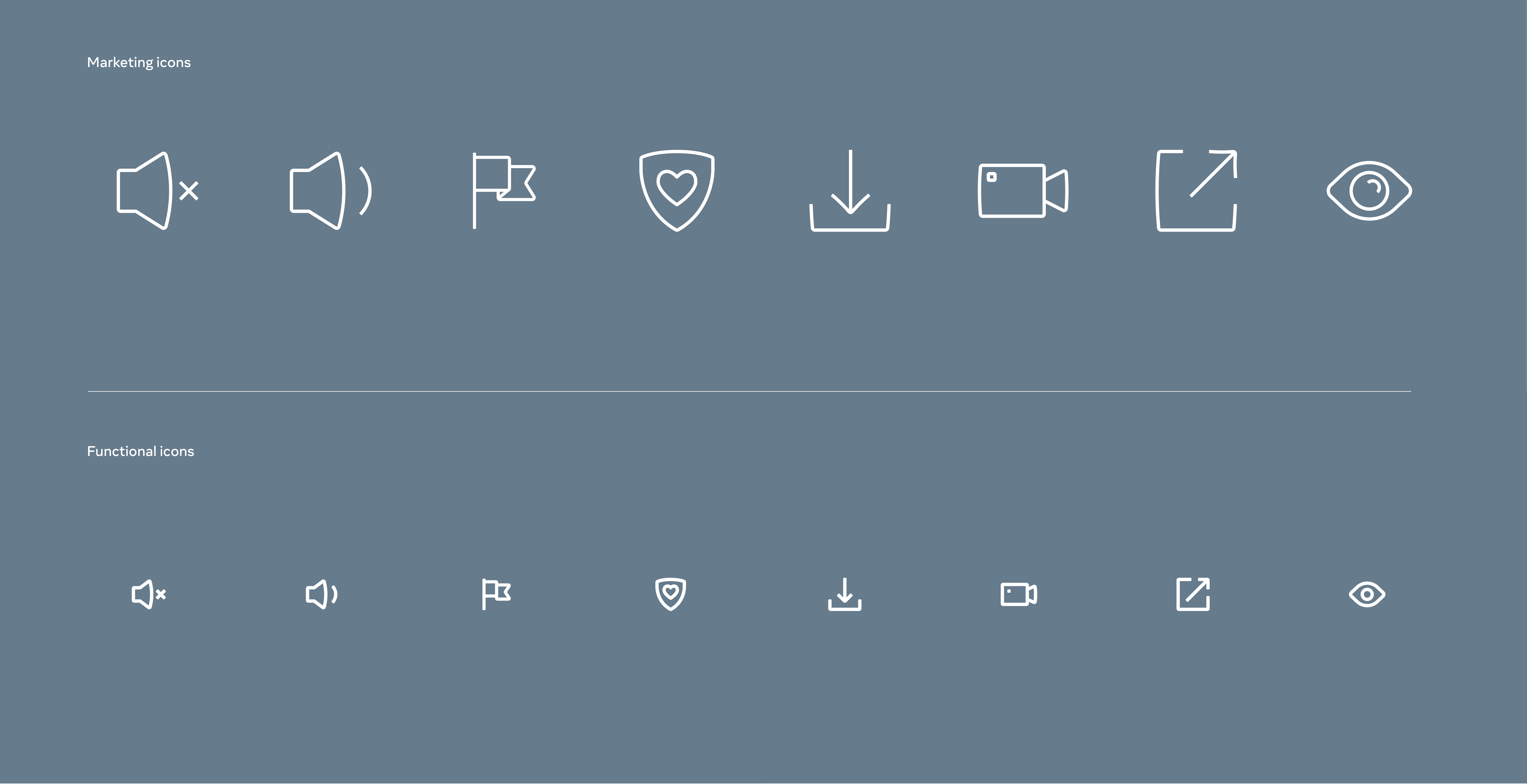
In 2020, Facebook Company asked the BUCK team to develop a cohesive icon system that could speak to its global audience regardless of any cultural or language barrier. The system also needed to flex across multiple touch points, such as product interfaces and marketing applications, which required scalability and adaptability in order to make it work at any scale.
Aesthetically, the visual language was rooted in the juxtaposition of humanistic curves with straight strokes, inherited from the Facebook wordmark.
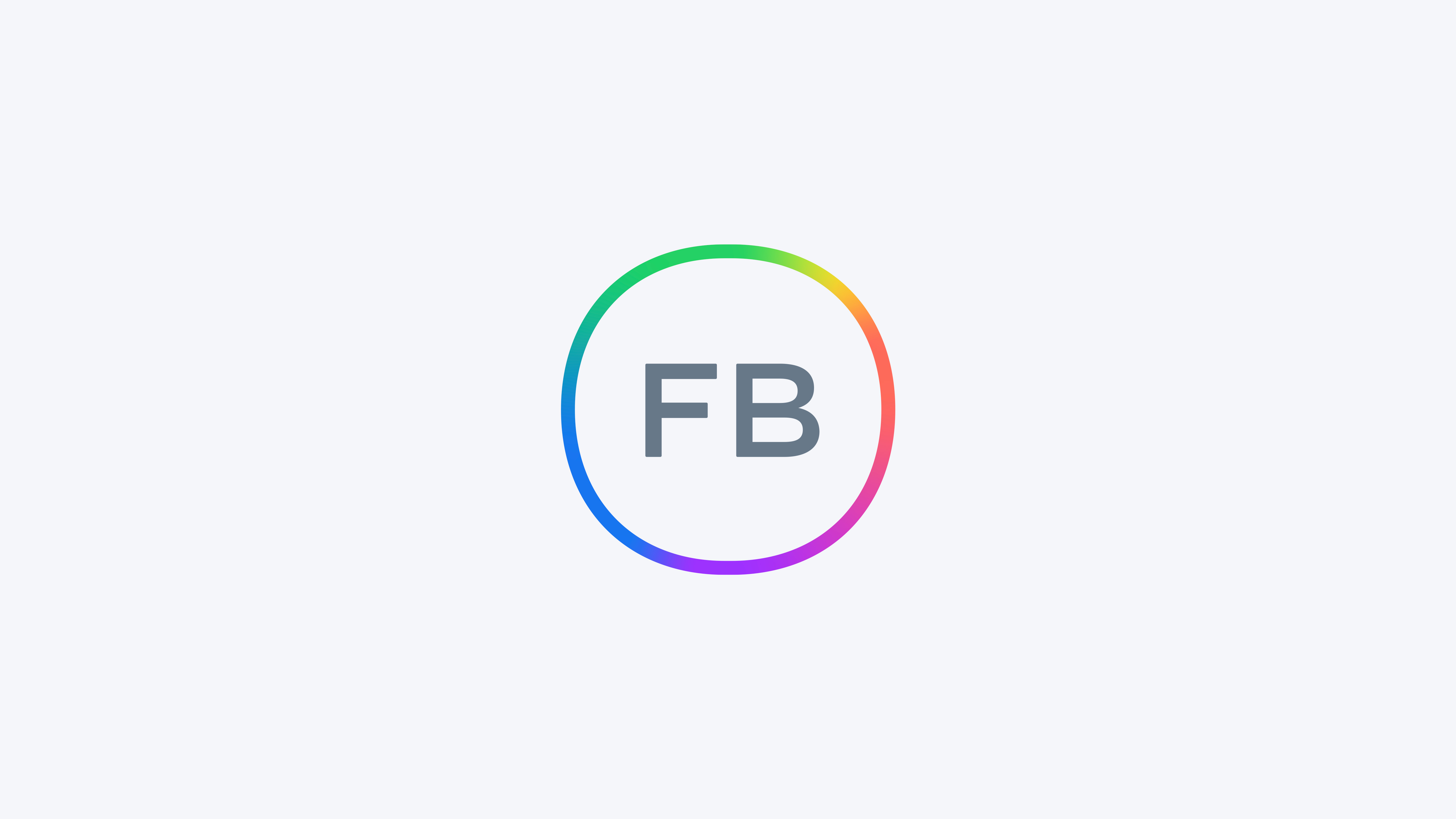
YEAR 2021 - FACEBOOK GRADIENT SYSTEM
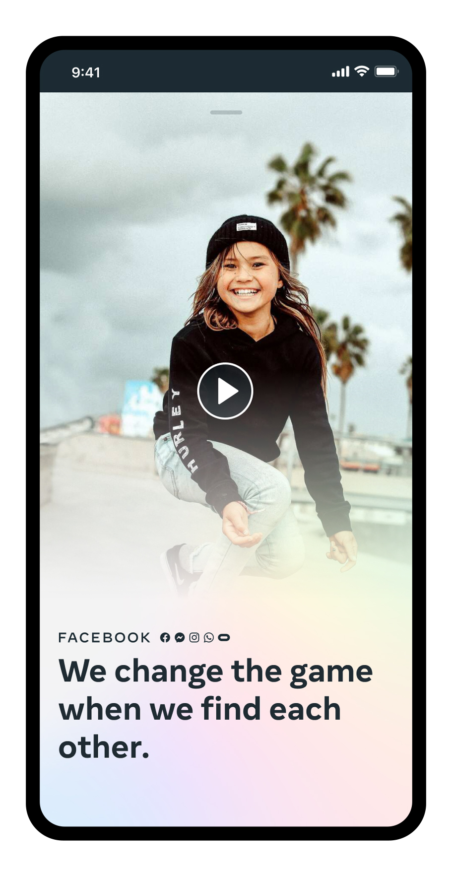
In 2021, I worked on an ownable gradient system for Facebook. At that time, the company was developing a comprehensive design system to help users understand that Facebook was more than just a social media app, but an ecosystem of company-offered products and services. In this context, a company gradient could help distinguish Facebook from the social app while creating a connection between all of their brands.
The gradient was meant to represent the sum of all their social technologies, incorporating colors from all of their products. Our task was to find a conceptual approach to the gradient and then create a comprehensive system around it, taking into account cross-app experiences.
The gradient was meant to represent the sum of all their social technologies, incorporating colors from all of their products. Our task was to find a conceptual approach to the gradient and then create a comprehensive system around it, taking into account cross-app experiences.
As a result, we conceived of the gradient as light and explored its potential behaviors and applications. In addition, the concept of an emissive source of light was incorporated into the system. Thus, whenever the gradient appeared, a source of light would be present, functioning in three different ways depending on the type of application: to establish, guide, and affirm.


Moving forward, as the brand
evolved towards a dimensional space, the next step was to explore the possibilities for the gradient to exist in that space. Understanding the gradient as an expression of light in an environment, what its behavior should be and, also, how could it assume certain dimensionality as well? A systematic approach was applied to create a motion system for the gradient and establish the logic behind it.
We explored the dynamic behavior of the emissive light and all the gradient colors during transitions between UI app screens and across different apps.
As the emissive source of light should help aiding navigation, it was necessary to understand how the other colors would react to the light movement.
As the emissive source of light should help aiding navigation, it was necessary to understand how the other colors would react to the light movement.
FROM FACEBOOK TO META
In 2021, Facebook officially became Meta, signaling the company's important pivot to building the metaverse. BUCK has partnered with the brand several times to explore and help build its new brand system, now considering its manifestations in the dimensional space.
In 2021, Facebook officially became Meta, signaling the company's important pivot to building the metaverse. BUCK has partnered with the brand several times to explore and help build its new brand system, now considering its manifestations in the dimensional space.
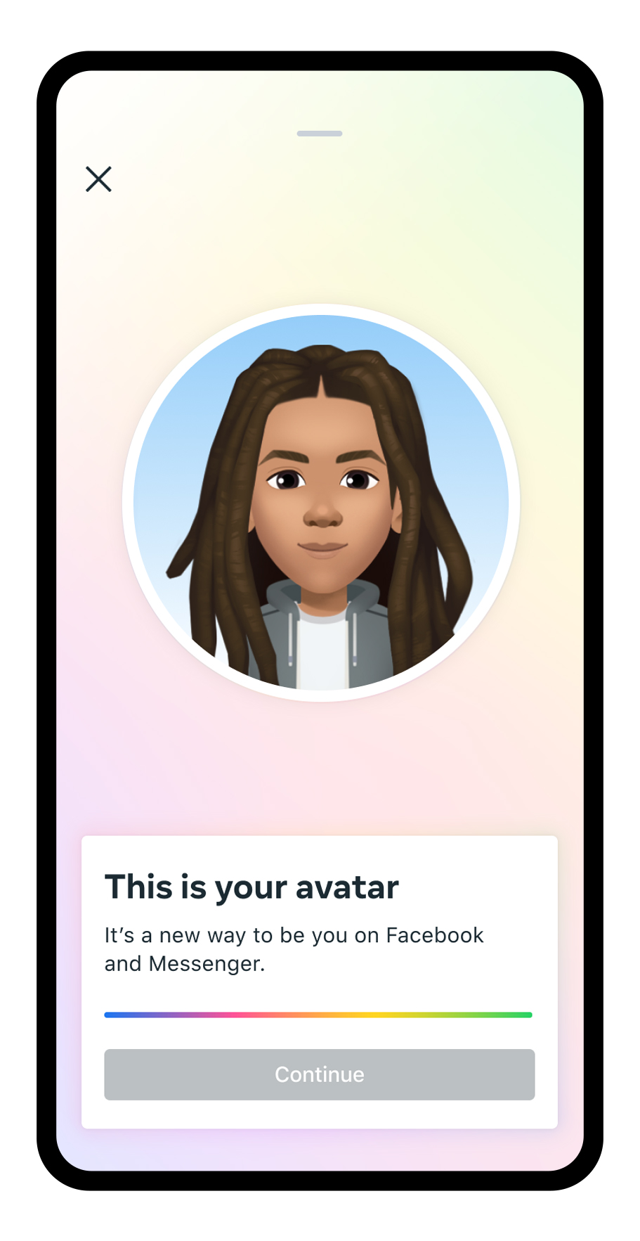
HORIZON WORLDS FUTURE VISION
A relevant project I had the opportunity to help lead at that time was the future vision for Horizon Worlds, Meta's collaborative platform in VR.
The goal was to ensure visual alignment with Meta’s brand guidelines, while enhancing Horizon’s own expressive, fun visual identity.
How could some brand elements, such as the company ring and the gradient, be present in meaningful ways throughout the experience? And, most and foremost, how could we infuse the Horizon Design System with some joy and delight?


One of the nicest achievments of this project was finding purpose for the company ring in some instances such as the wearable device, as well as the game intro where the user's avatar is introduced.
Through systematic thinking, the team explored how key principles from Meta's Design System could be seen through the lense of Horizons. Themes like light, dimensionality, materiality, motion and color were incorporated to Horizon's design system.
Through systematic thinking, the team explored how key principles from Meta's Design System could be seen through the lense of Horizons. Themes like light, dimensionality, materiality, motion and color were incorporated to Horizon's design system.


Another project I worked on as a design lead was a sprint to help refine some brand system motion behaviors. Thinking about how the brand could still have a sense of dimensionality even in two-dimensional spaces was key to establishing some motion principles that were further developed by the brand.
The new brand was launched at Meta Connect 2022, Meta's annual conference on VR and new technologies. BUCK worked with the brand to develop the complete visual identity for the event and implemented all the branding elements developed throughout the year. Discover more about this project by clicking here.
Created at BUCK.